Introducing version 1
Posted November 16, 2021 · 3 min read
I've been updating the design and appearance of this blog for the last six months, and I've finally reached a point where I want to say: This is version 1. I need something concrete to stop me from continuing to second-guess the structure, and this post is it!
Designing the site
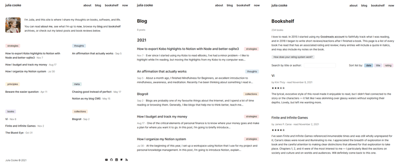
This is what version 1 looks like:
My goal for the first iteration of my site was to make it simple to start and then see where to go from there.
Everything should be made as simple as possible, but not simpler.
— attributed to Albert Einstein
At times, I found it difficult to decide what was necessary and what was extraneous. For example, I originally didn't want to categorize my posts, but later decided that sorting them very broadly might help readers navigate the breadth of what I wanted to write about. I imagined someone visiting my blog exclusively to read my musings and wanted to make it easy for them to find those specifically.
I've included this example to illustrate what I think is the main lesson I took away from designing my site from scratch:
Understanding how something will be used is absolutely crucial to designing it well.
Most of the decisions I had to make came from questions I asked myself about the site's usage — who would be using it and for what purpose. These are some of the considerations I made:
- Who will be visiting the homepage? Will it be someone who reads my blog regularly (in which case I should show them my most recent post, so they can read it immediately) or someone who's seeing it for the first time and needs more context?
- Will the person reading the "About" page know me? What kind of information about me will they be hoping to find?
- When someone looks at my bookshelf, will they be interested in the titles? The reviews? The ratings? Will they be looking for a specific book, or just generally curious?
- Will it matter to readers when a post was published or updated?
...and so on. I didn't know the answers to many of my own questions, which meant that I had to use my best judgment. Part of my excitement with releasing version 1 is that I can shift my focus to my site content and hopefully learn more about how my site is used over time.
Working on the design was also such a clear reminder that what I look for has such an influence on what I see. I regularly visit at least a dozen blogs, but when I tried to picture what their sites looked like, my mind went totally blank. Now, whenever I'm on someone's website, I pay close attention to how it's structured and designed, and I think about what works or doesn't work or what I like and don't like. It's like attending a wedding: you spend a lot of time thinking about whether or not you'd want their decorations, their dress styles, or their music at your own wedding (or at least I do)!
Inspirations and influences
I spent a lot of time looking at other websites (and occasionally GitHub repositories...) for inspiration. Some definitive inspirations that deserve due credit:
- I used Jared Palmer's layout as the model for my header and footer.
- Andrew Healey's homepage gave me the idea to include a mini bio and feature my most recent posts. I was also so impressed with how beautifully his slight modification to the letter spacing on the font we both use, Inter, looked, but I concluded that "borrowing" that would be a step too far!
- I enjoyed binge-reading Justin Duke and Derek Sivers' book lists so much that I decided putting my own reviews on an infinite scroll list was the way to go.
- The idea and implementation of utteranc.es for my blog comments came from Tania Rascia's blog post. Her site is also where I first saw the "buy me a coffee" sponsorship model.
- All of the colours for my buttons are replicated from Notion.
Moving forward
Now, time for the public commitment: less code tweaking, more word writing :) See you there!

Comments